FOCUSED.
Focused
Brand Refresh
Focused is a destination for productive and collaborative remote work. As an innovative virtual co-working and coaching startup, they've set out to revolutionize your workdays. They offer a dynamic fusion of daily planning calls and expertly facilitated virtual co-working sessions.
I was hired to improve the overall look and feel, create a brand strategy, and produce a design system that would capture the essence of what they were trying to do as a company.
My Role
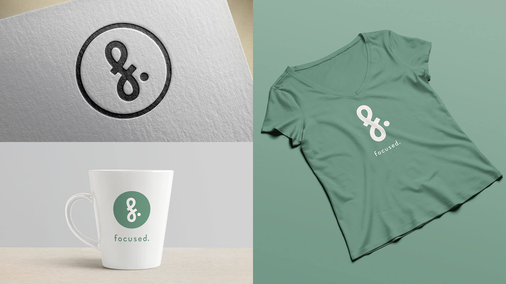
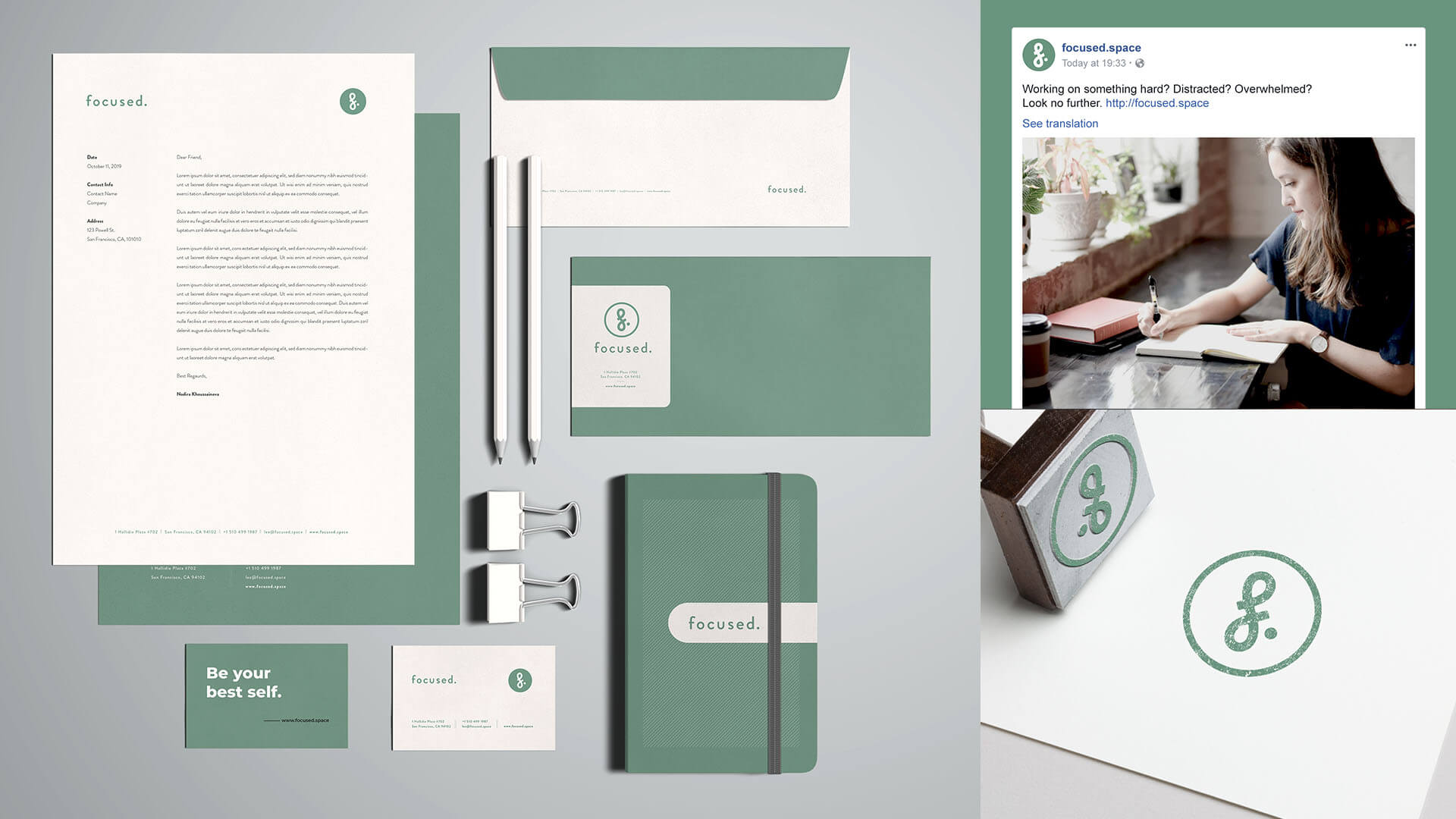
As a visual designer, I undertook the task of revamping Focused's look, creating a new logo and improving the website's appearance. I explored various design ideas for a cohesive and appealing new look. My primary goal was to design a modern logo that represents Focused's essence while also aligning the website with its current and future vision for a seamless user experience. This redesign not only enhances aesthetics but also communicates a visual narrative, making Focused inviting and user-friendly for productive collaboration.
Focused
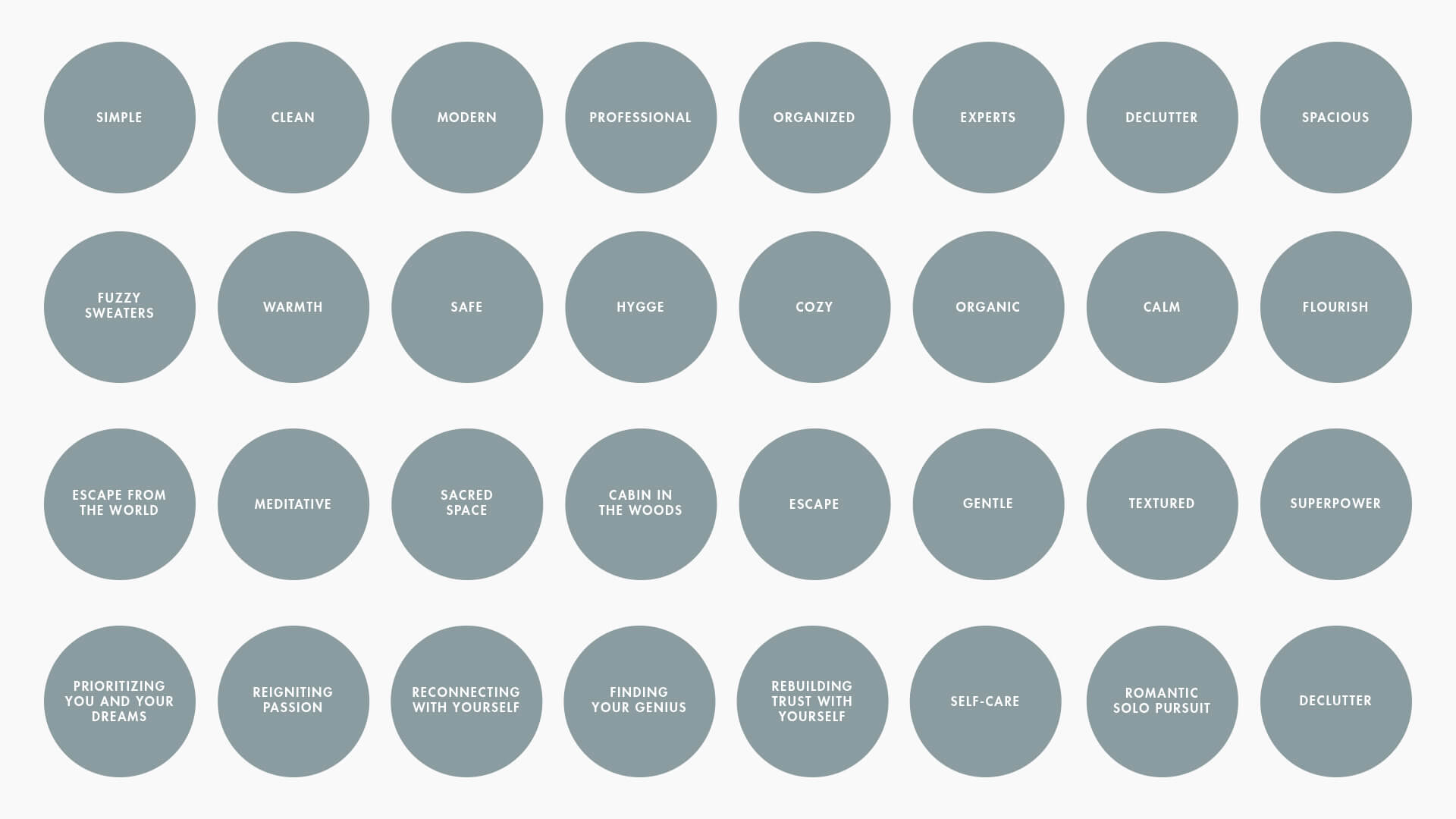
Word Mapping
To get the ball rolling, I asked the client to participate in a word mapping exercise. It served as a powerful compass, guiding the creation of a brand's visual identity. By distilling core values, emotions, and aspirations into a web of carefully chosen words, it provided a clear direction for where to start developing a few visual directions.
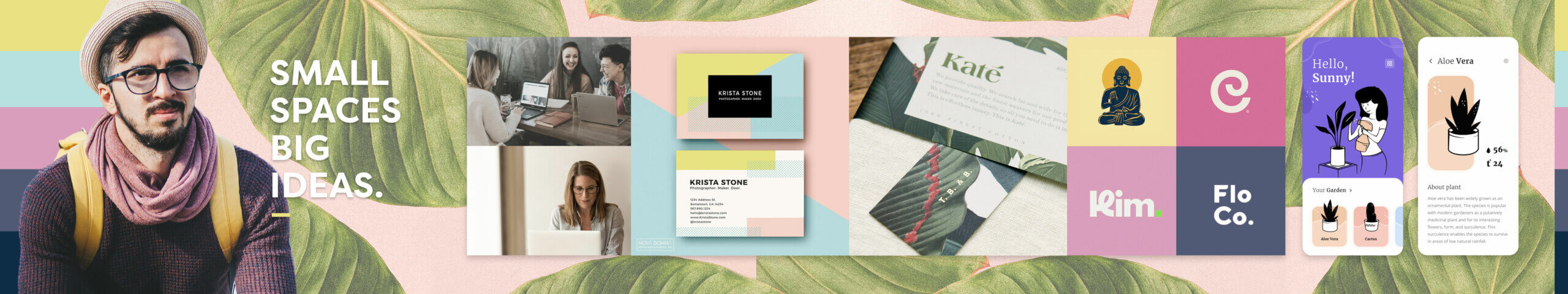
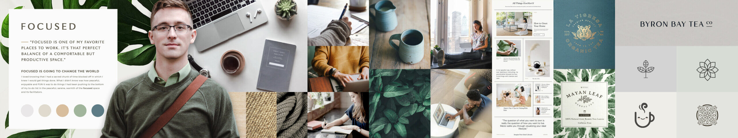
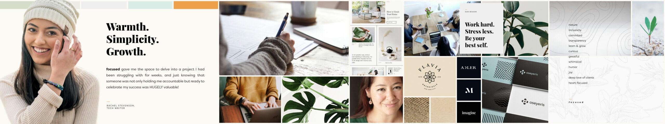
Stylescapes
After the word mapping exercise, I crafted a few style scapes to vividly portray the envisioned essence and ambiance of the brand. Merging essential brand elements like colors, typography, images, and tone, I created a harmonious visual representation that provided a sneak peek into potential overarching aesthetics and different ways.
Outcomes
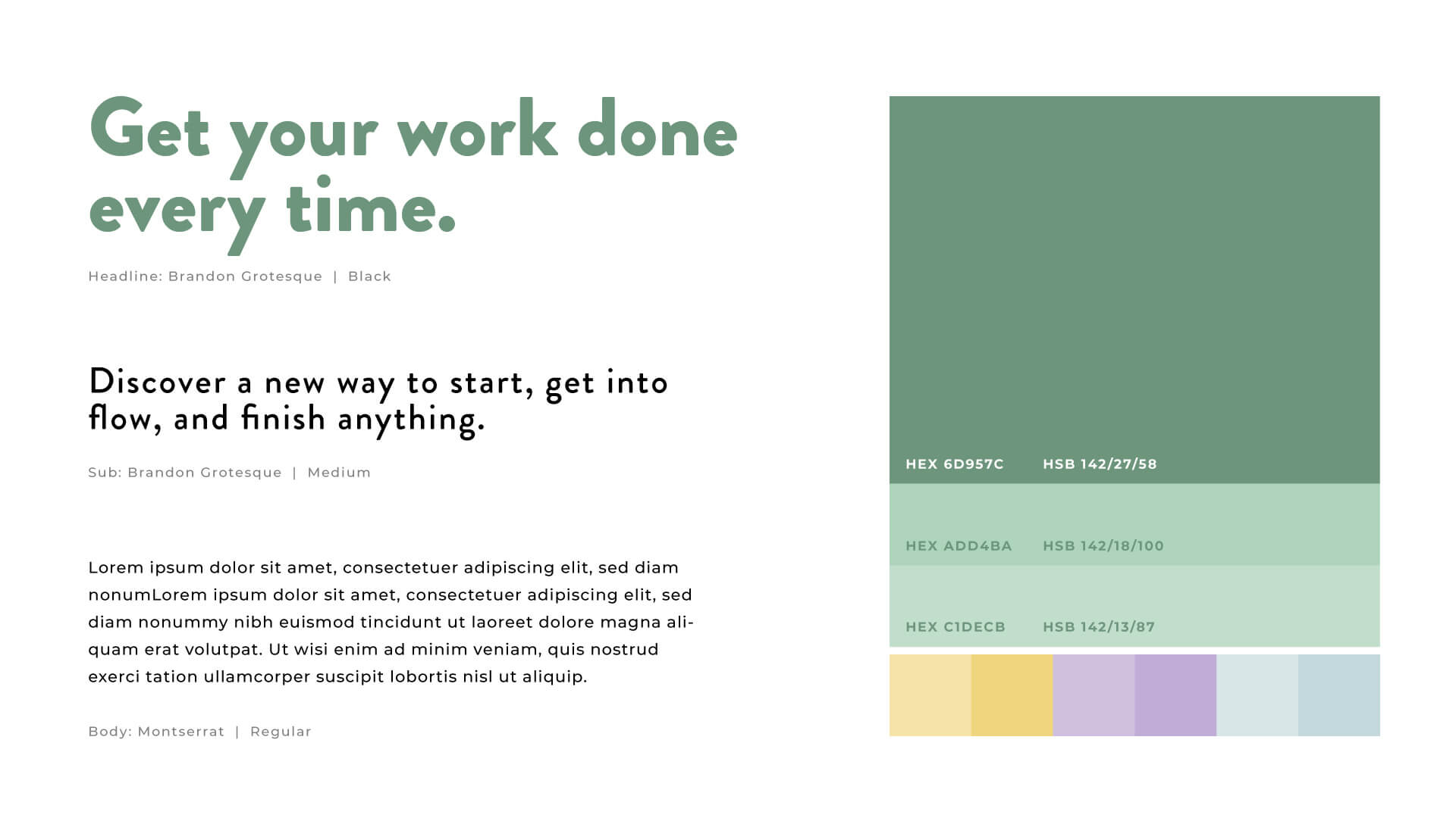
The client found both the word mapping and style scapes exercises extremely valuable to help articulate their ideas and to get everyone on the same page. The final designs for the logo, typography, and general look and feel borrowed from all three style scapes.
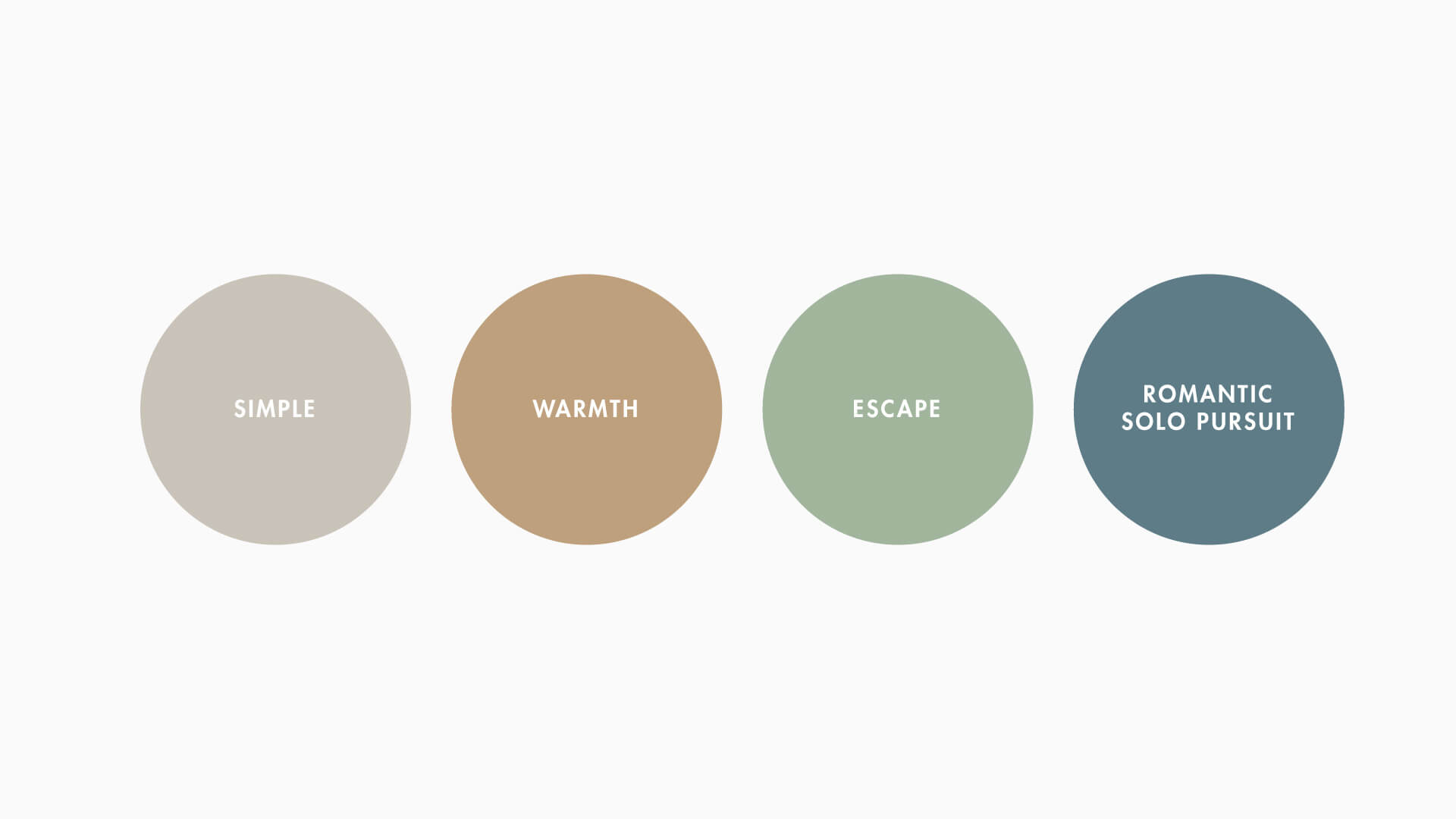
Simple
- Modern type
- Clean lines
- Abundant white space
- Minimal design elements
Warmth
- Earth tones
- Nature imagery
- Curves
- Friendly voice and tone
Escape
- Meditation
- Whimsical
Romantic Solo Pursuit
- Curious
- Learning and growth
- Committed
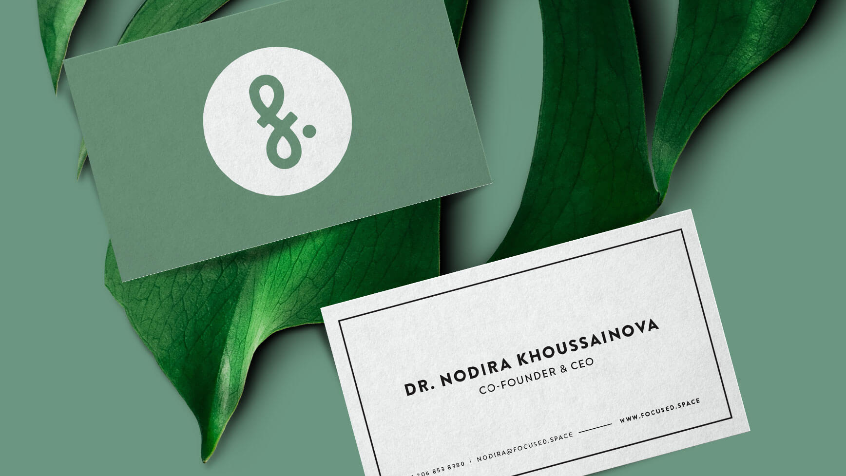
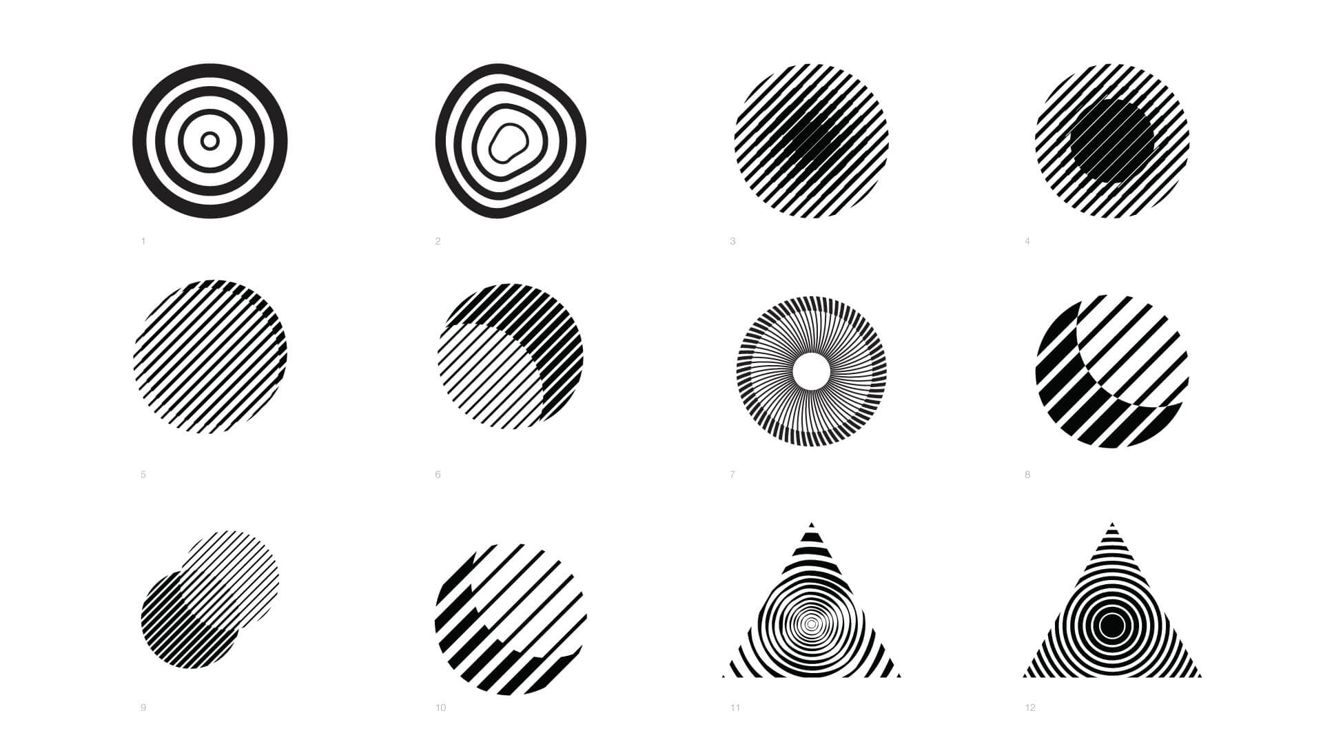
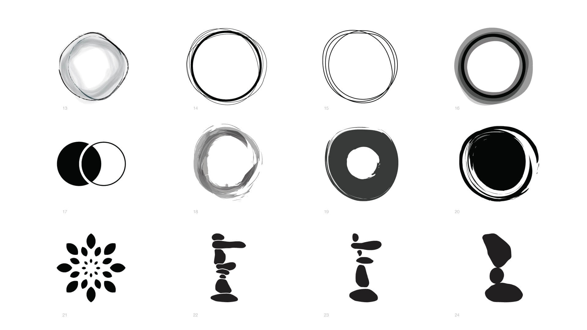
Logo ideation
I experimented with dozens of ideas for the logo mark. I explored every way I could come up with to express the idea of "focus." Below are a few examples of what I came up with.
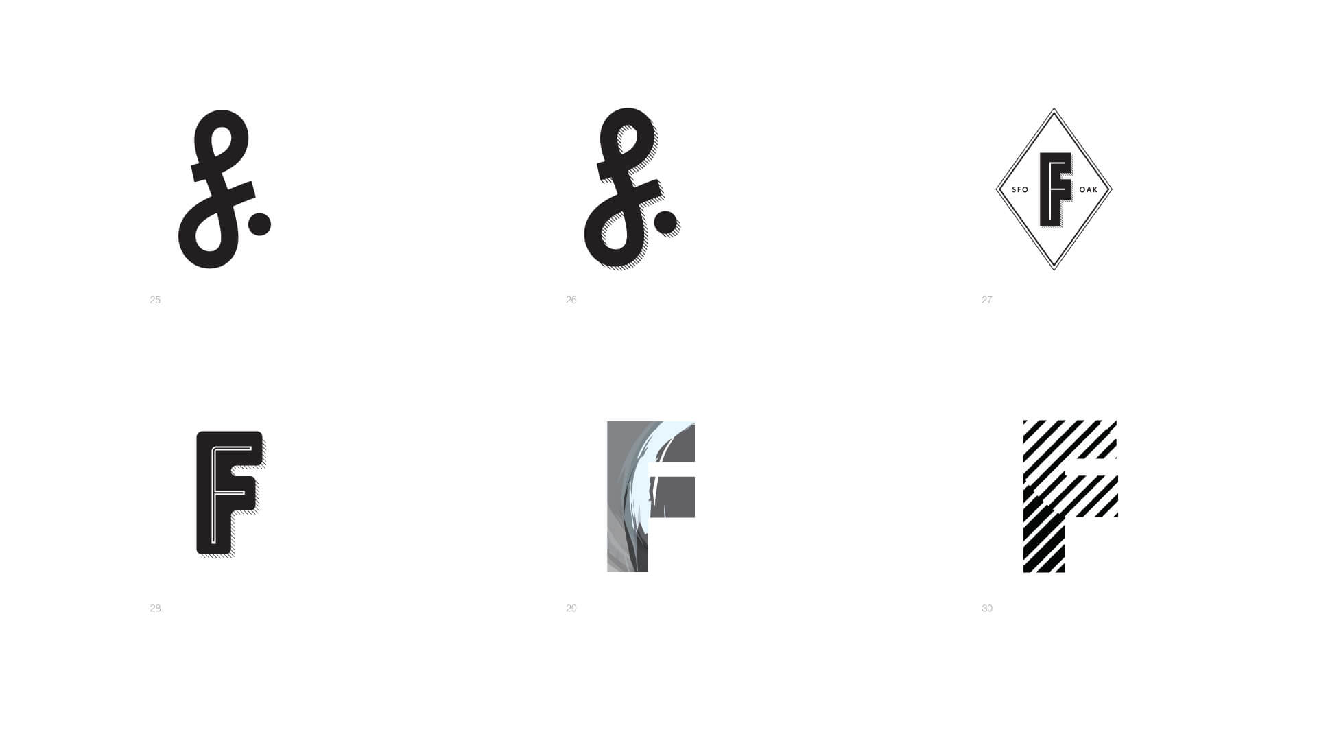
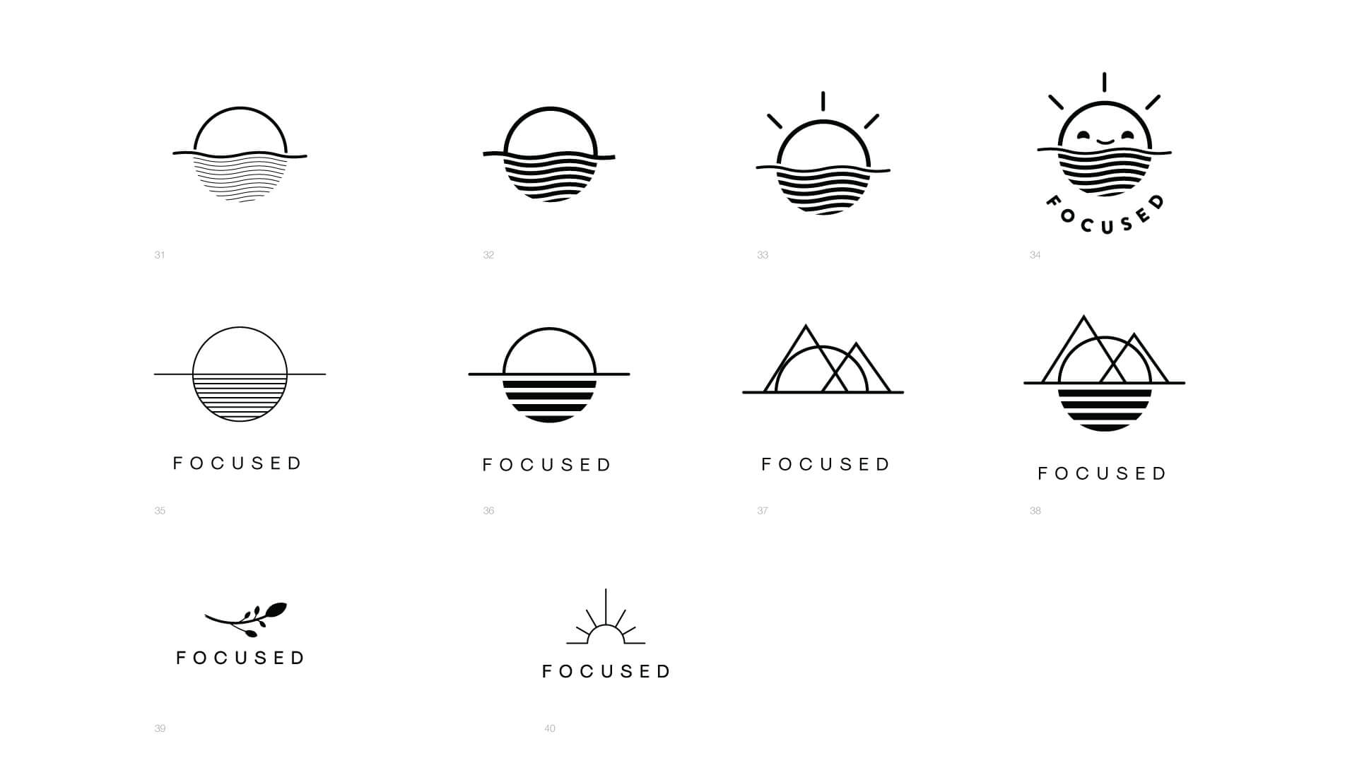
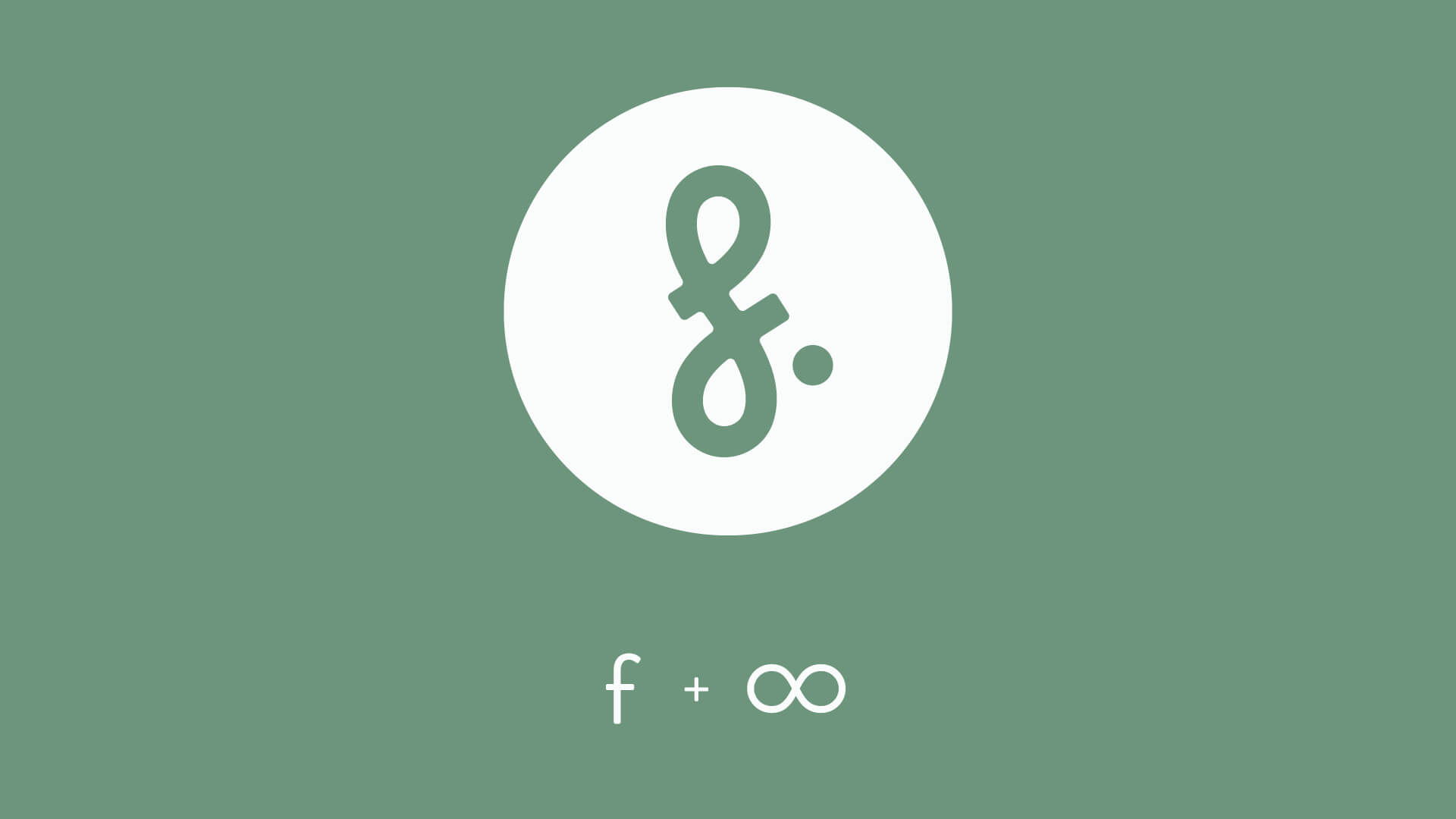
Chosen direction
The final chosen direction was based on the idea of simple, clean lines with a whimsical modern take on the lowercase "f." There is also a reference to the infinity symbol, which is used in meditation.
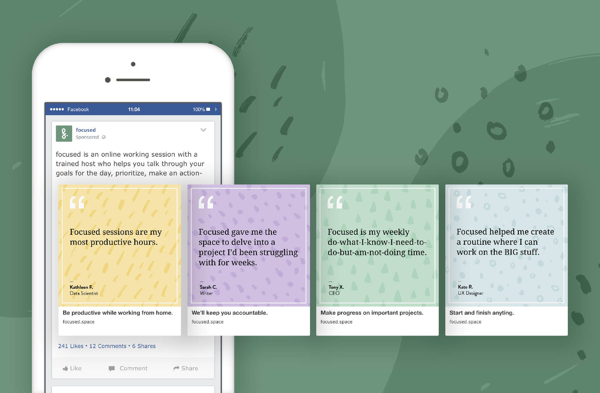
Social Ads
To get the word out, Focused placed several social ads. I created a design language that included a hand-drawn look to keep things feeling human and approachable and easily extendable.
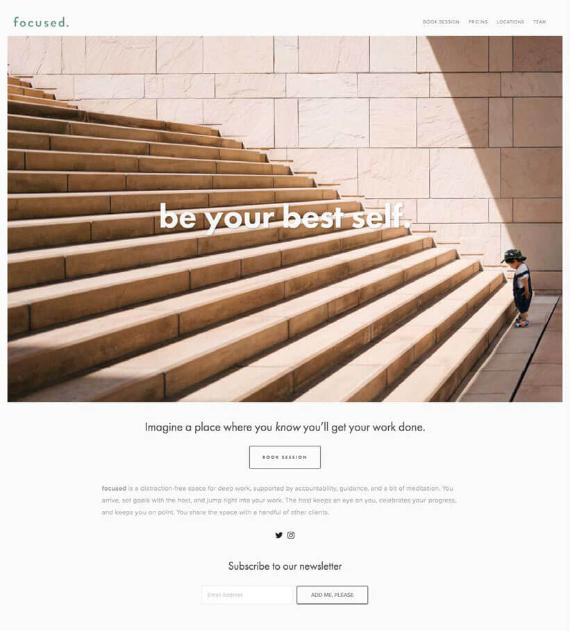
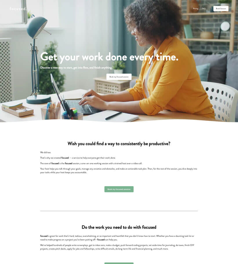
Website redesign
Built with Squarespace, I redesigned the website with a fresh new look and feel. I introduced video and illustrations to help tell the story of how Focused works and kept things simple with small amounts of text with a lot of whitespace.