BARNES & NOBLE
Nook
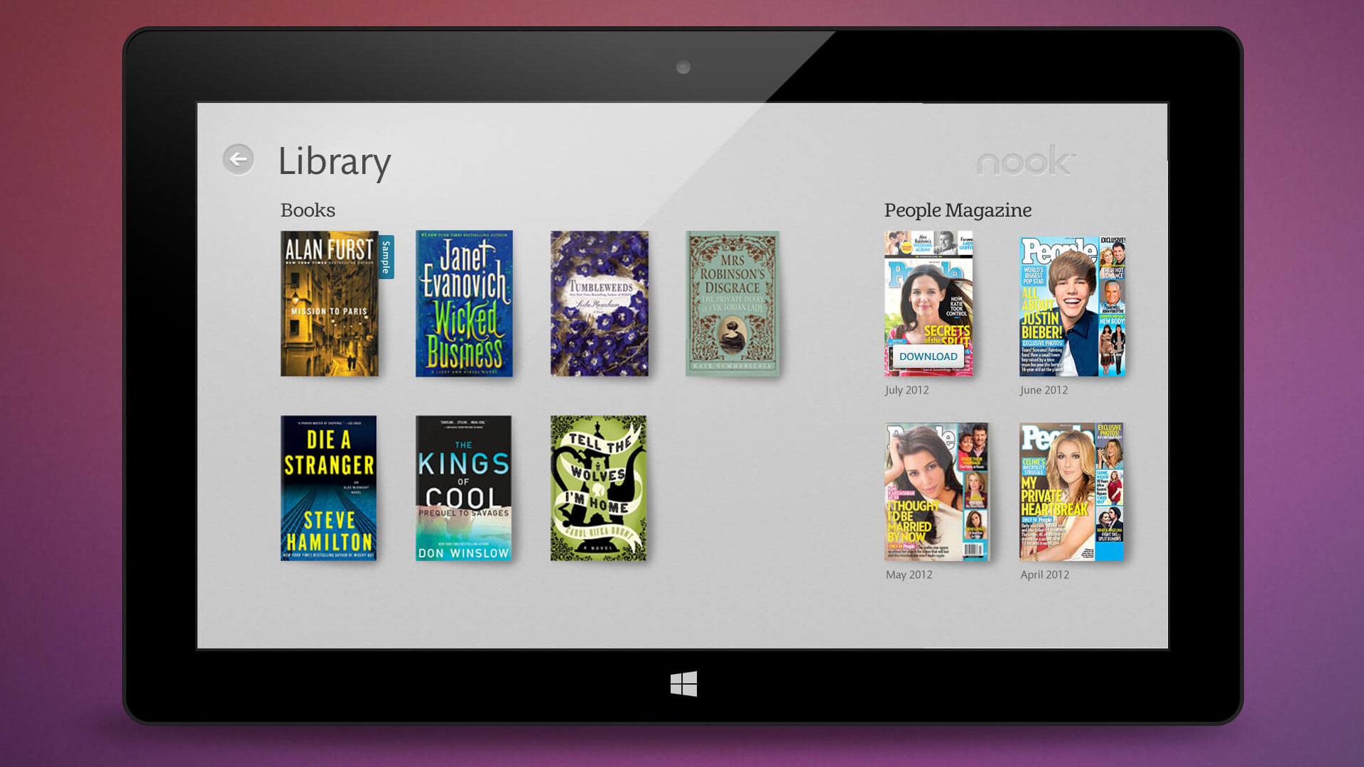
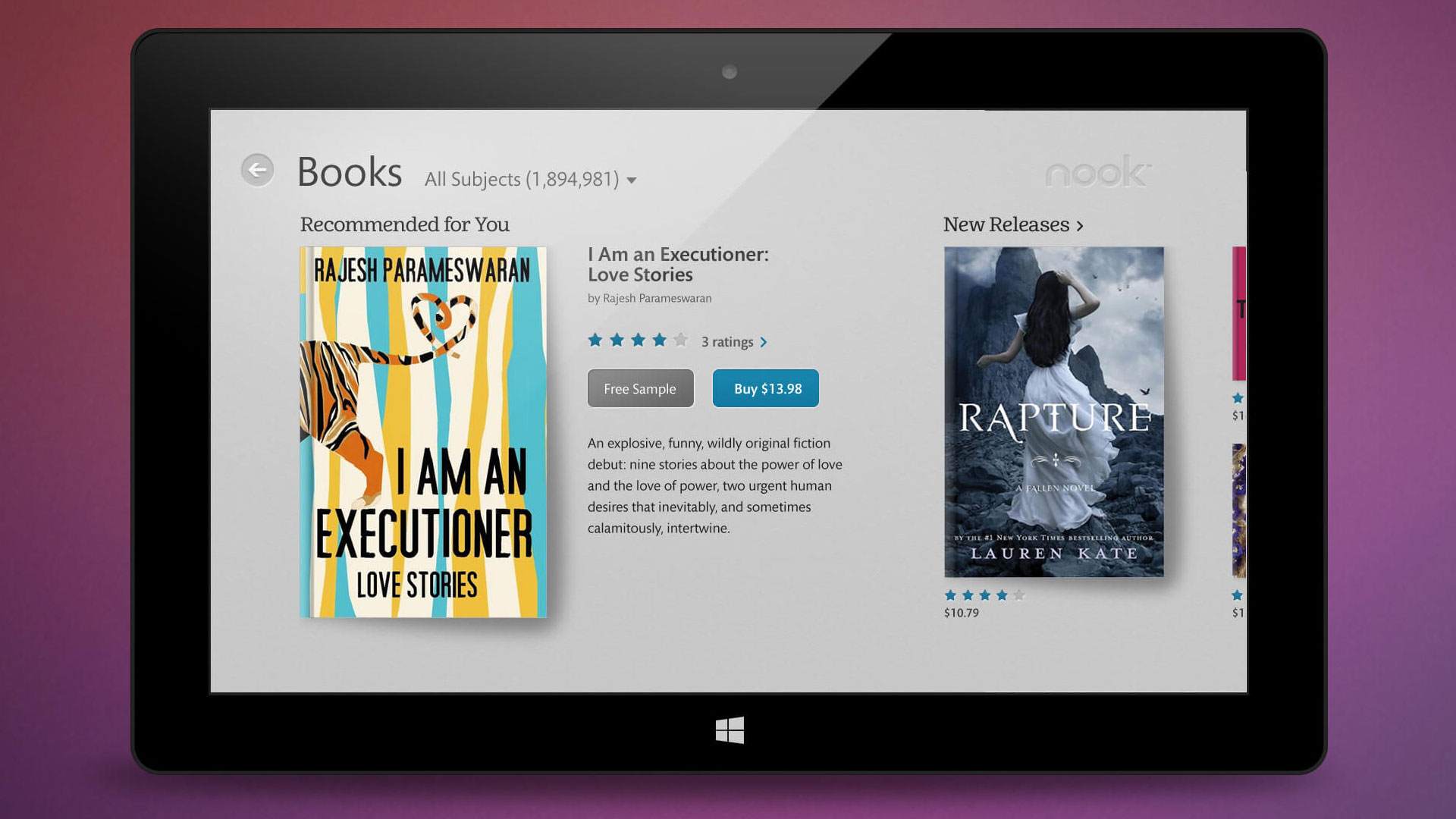
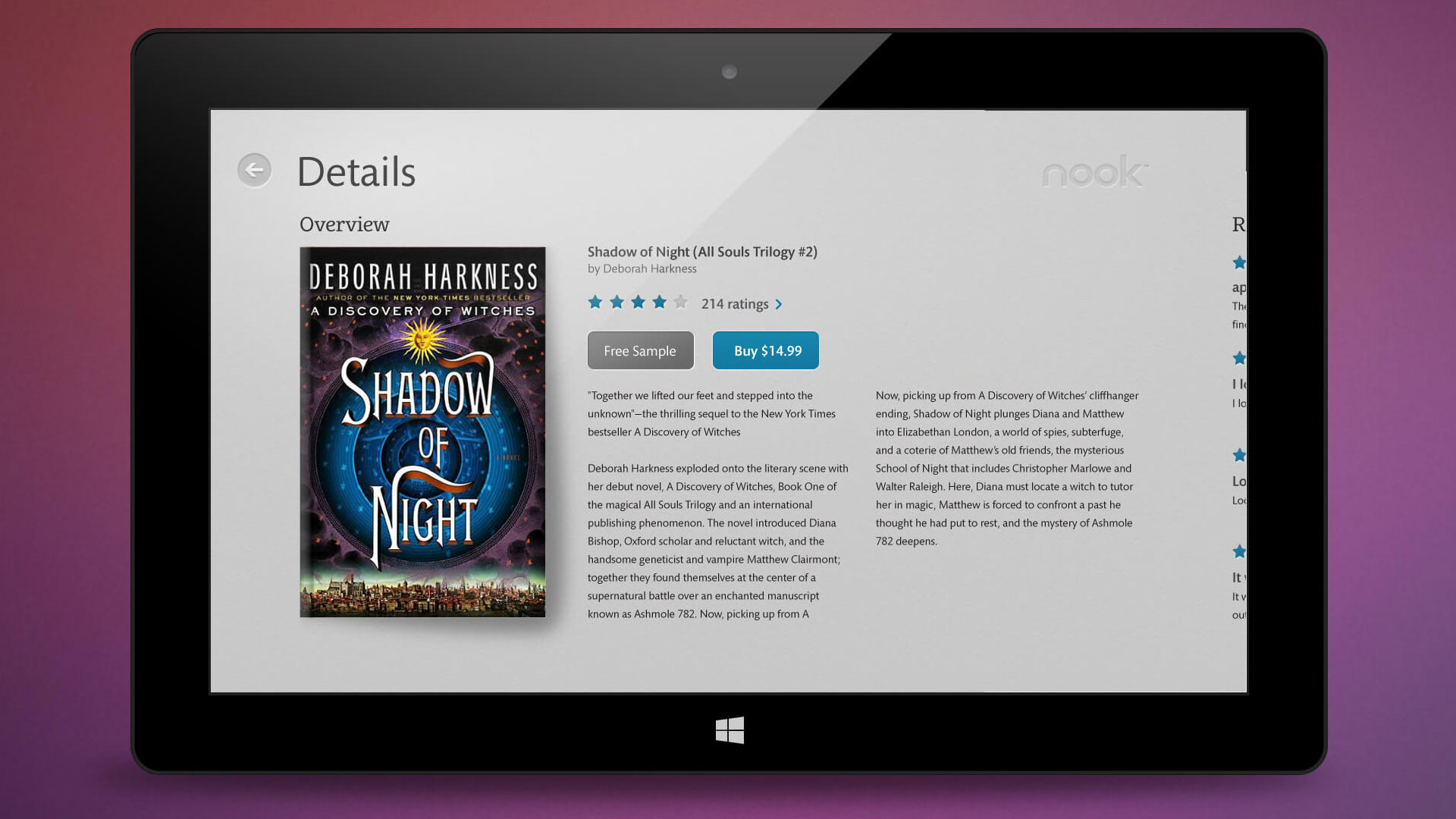
Reader + shopping experience
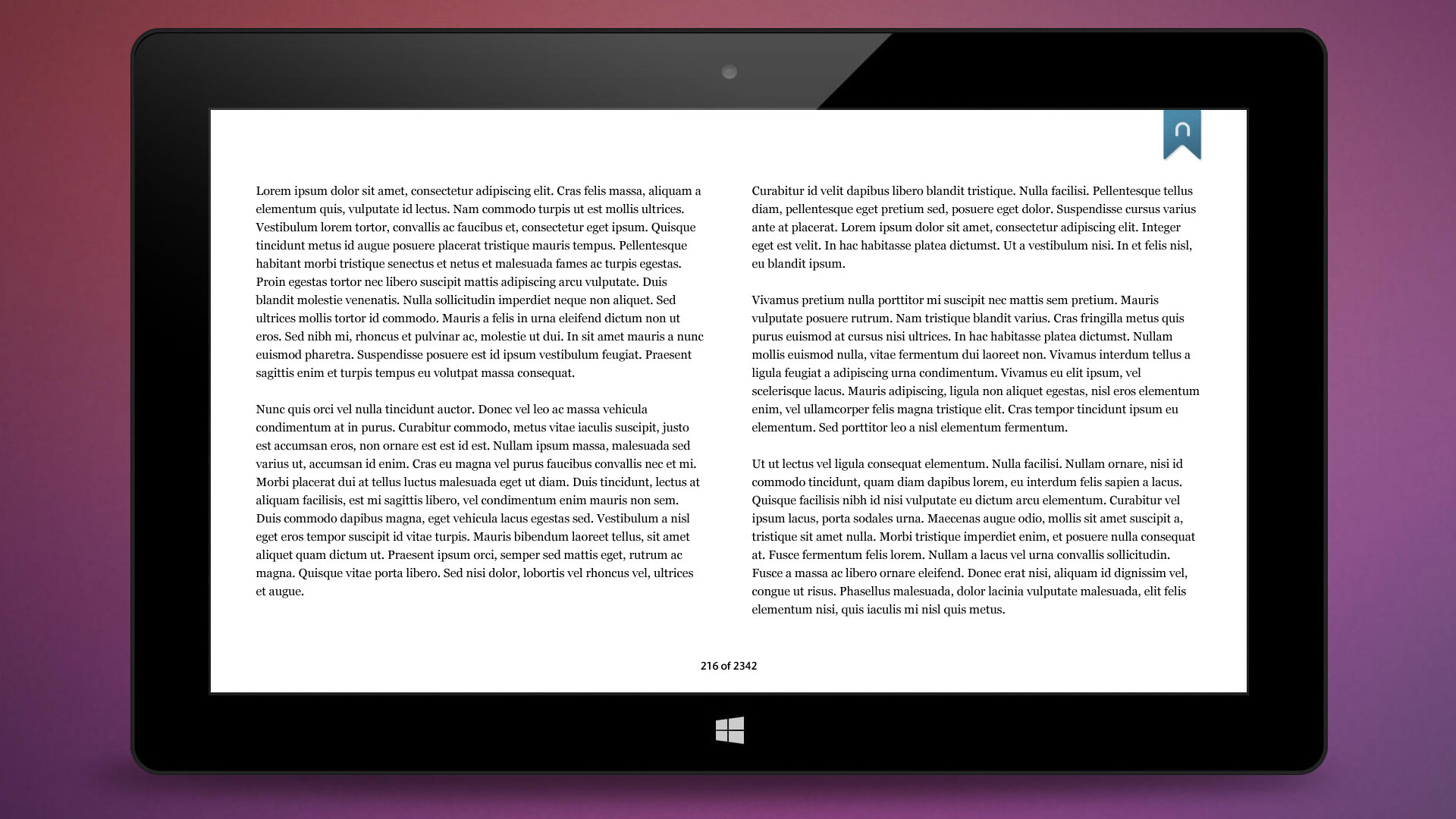
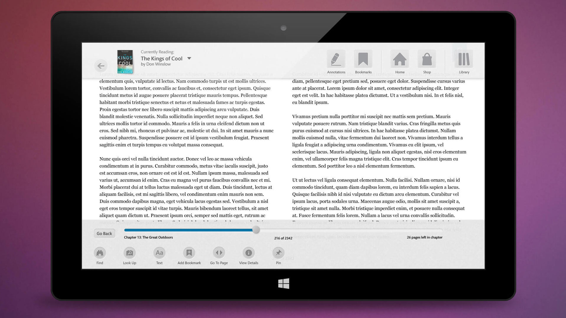
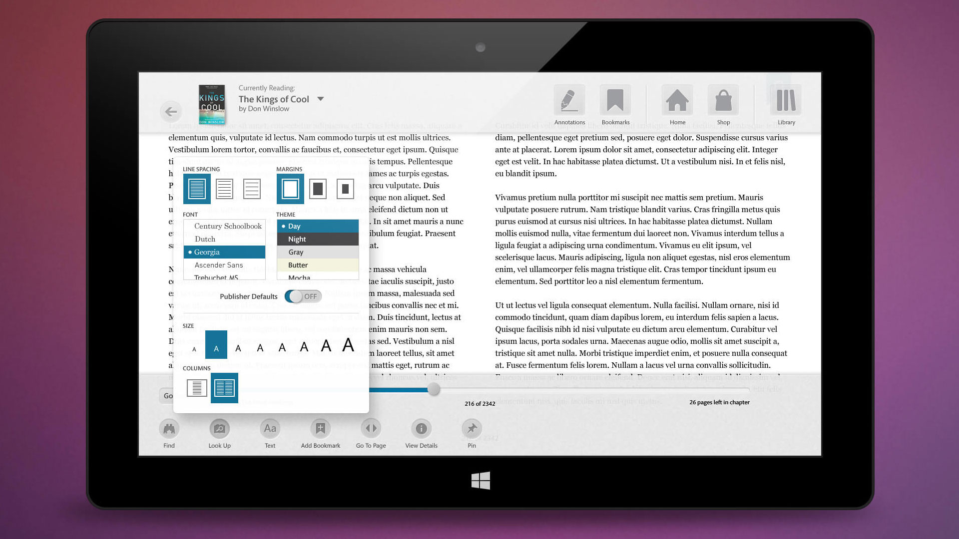
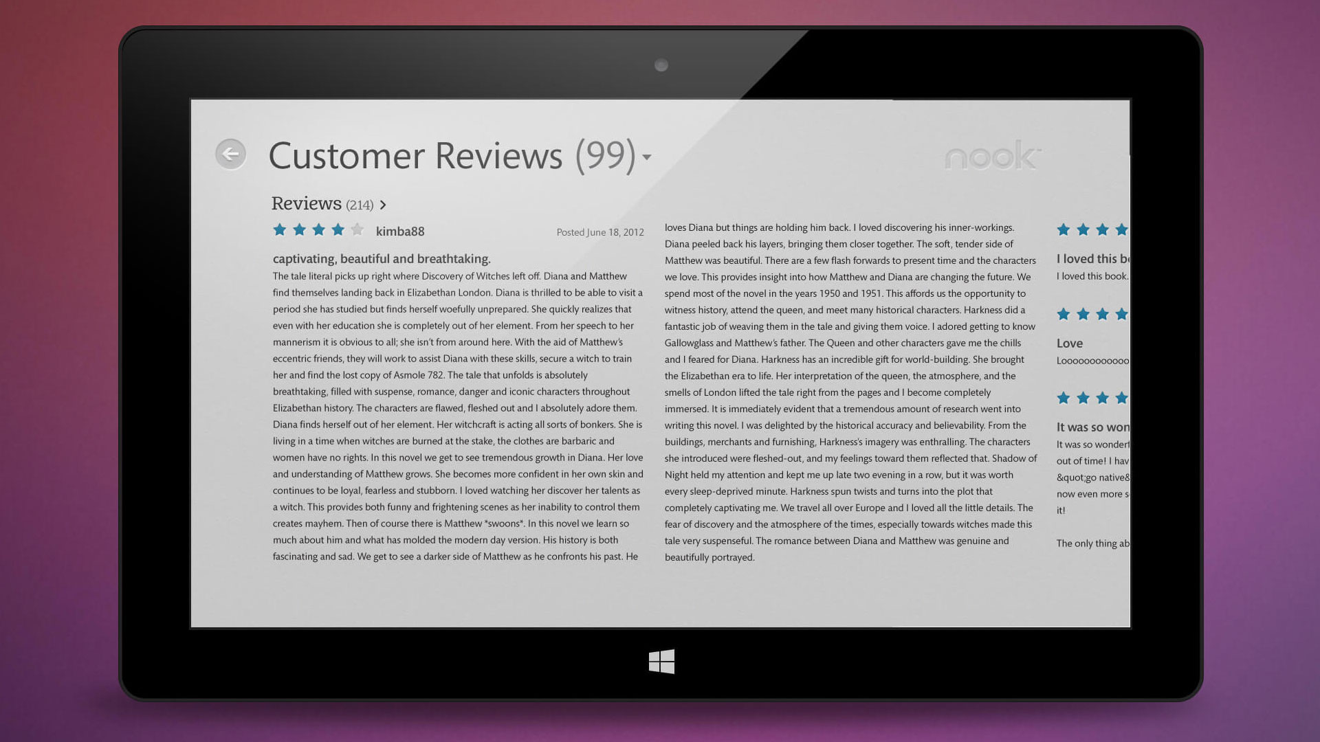
Stimulant was contracted by Microsoft to collaborate with the Nook team at Barnes & Noble. Together, we designed and developed a touch-first launch application specifically for the Windows 8 tablet, which served as the precursor to the highly successful Surface tablet.
The Challenge
The task at hand was to seamlessly integrate Nook's distinctive visual identity with Microsoft's evolving Windows 8 design language, while also effectively communicating with and aligning the priorities of multiple stakeholders from both Barnes & Noble and Microsoft.
My Role
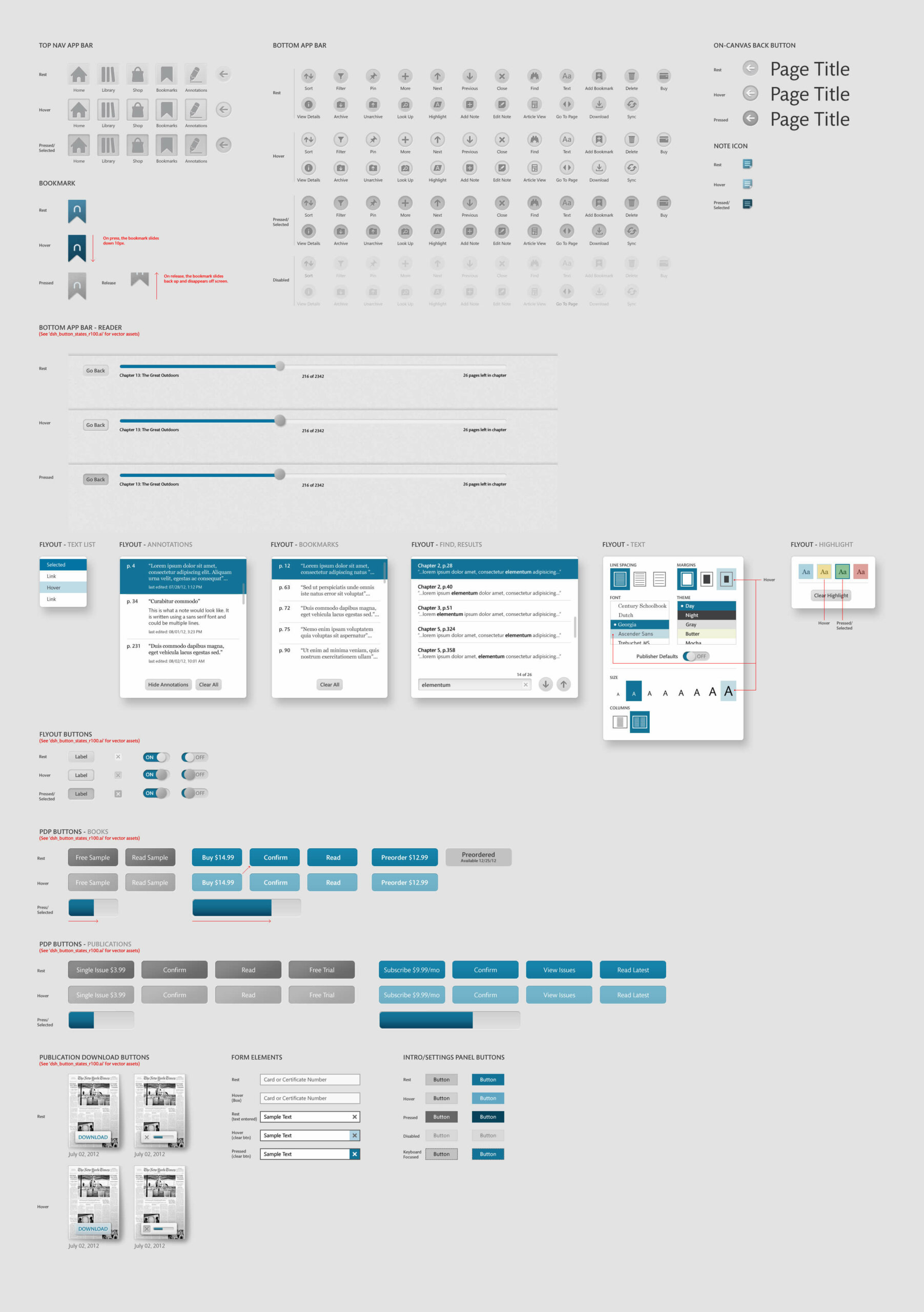
As the Lead Visual and UI Designer, I worked closely with the Nook Brand and UX teams to create a cohesive visual language that adhered to the established Nook design system. Additionally, as the launch app for both Windows 8 and Surface, I navigated the challenges of aligning with Microsoft's evolving design language for Windows 8, to ensure a seamless integration with the new operating system.
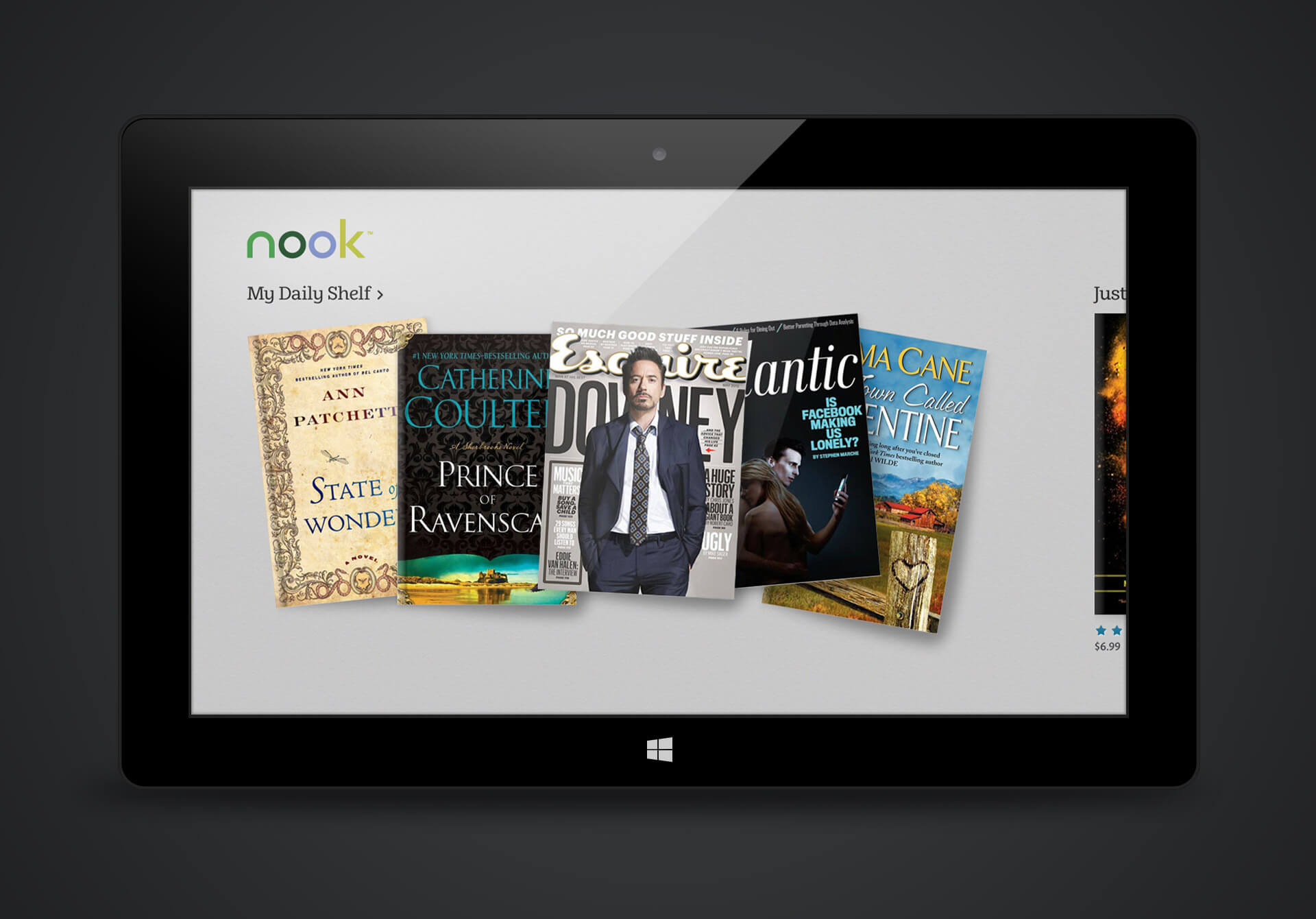
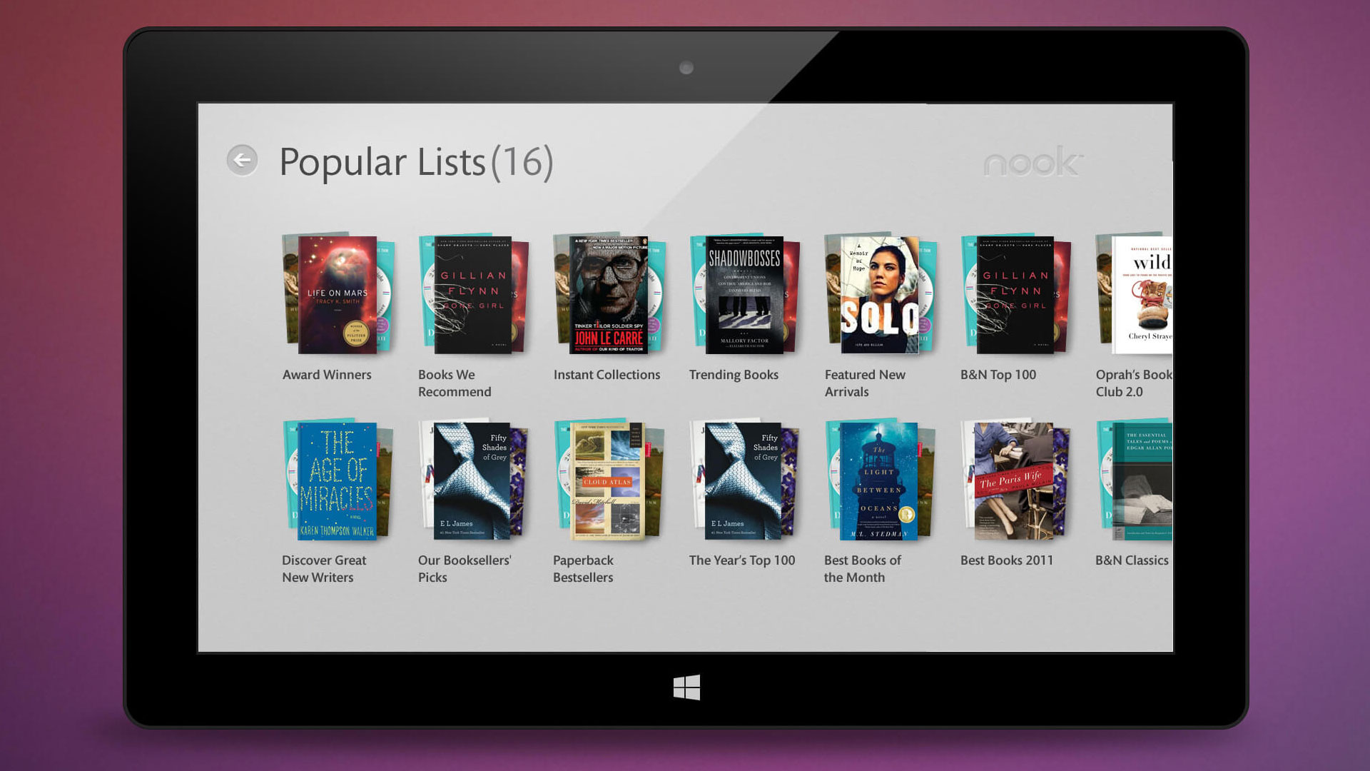
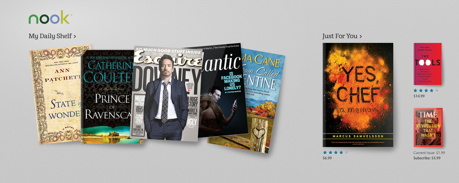
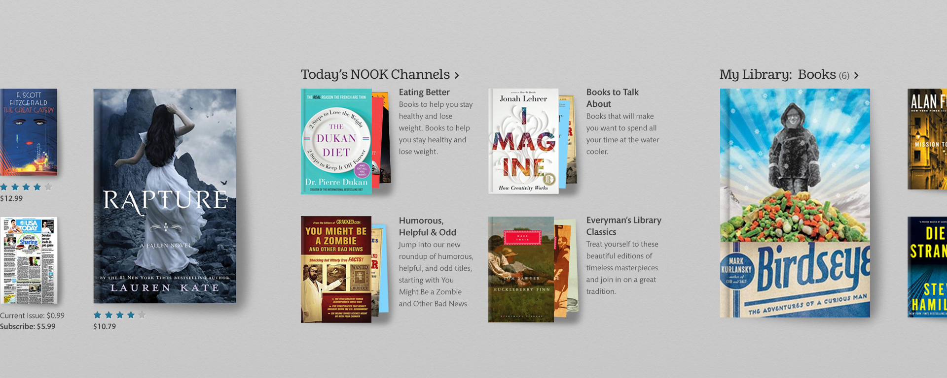
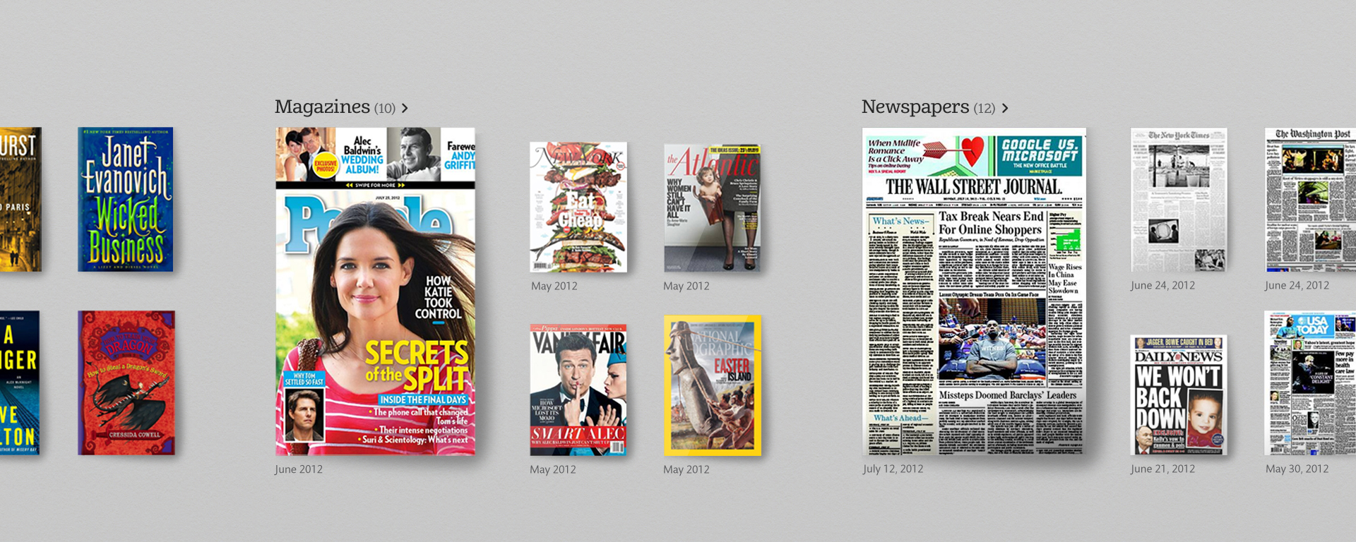
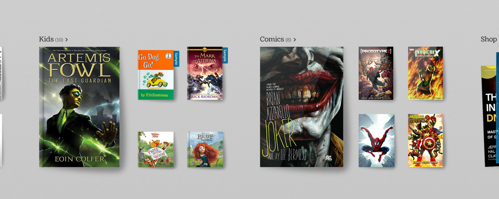
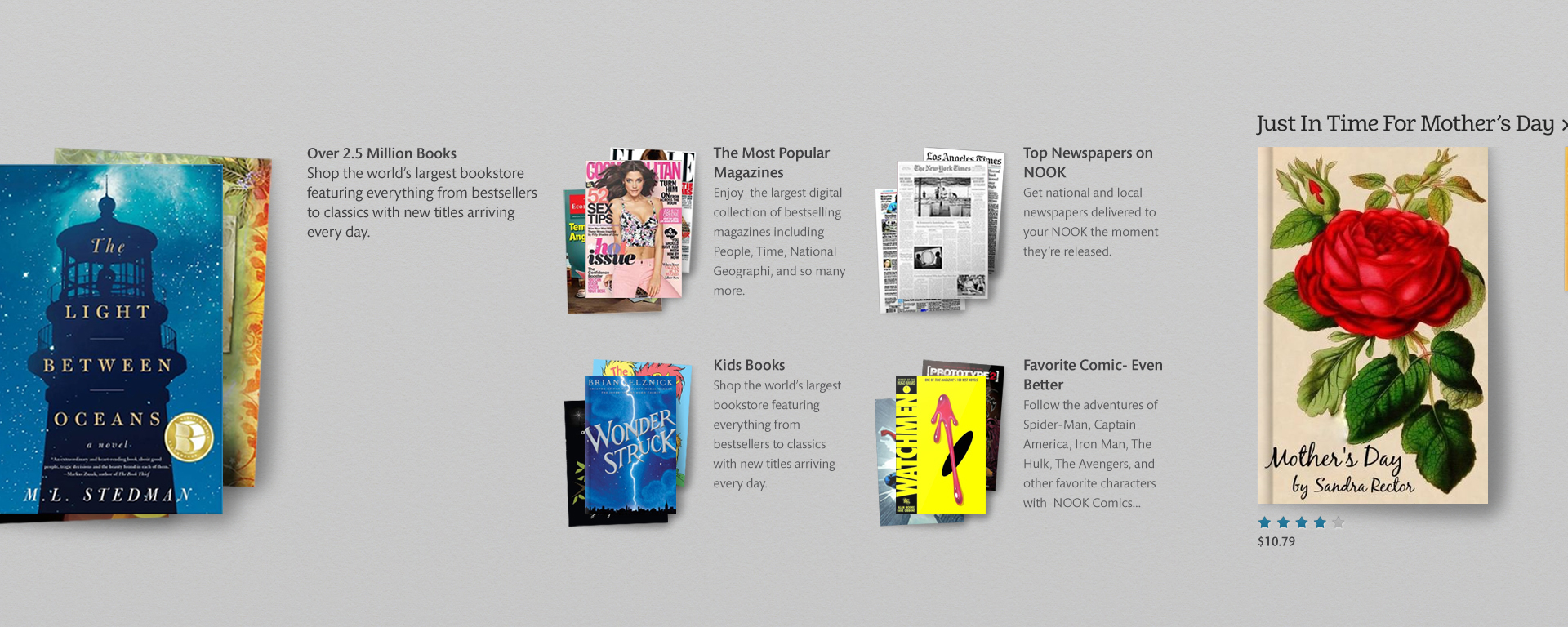
Product Stacks
Problem —
Microsoft's new Windows 8 design system was built on a flexible grid system, promoting the idea of being "authentically digital." This grid system didn't play nice with the organic look and feel of the Barnes & Noble visual brand system.
Solution —
I asked our developers to engineer a solution that could showcase the products as they would be seen in a Barnes & Noble retail store. Each product cover image is randomly rotated and overlapped to achieve the appearance of a stack of books or magazines that have been laid out across a table.
I helped Microsoft and Barnes & Noble come to the conclusion, that a company's visual brand should take precedence over a design system that allowed us to use product stacks.
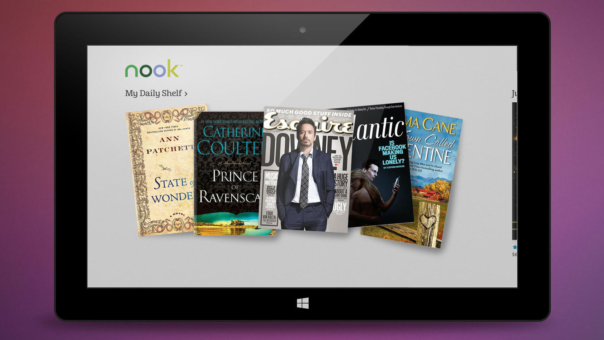
← Click + Drag →
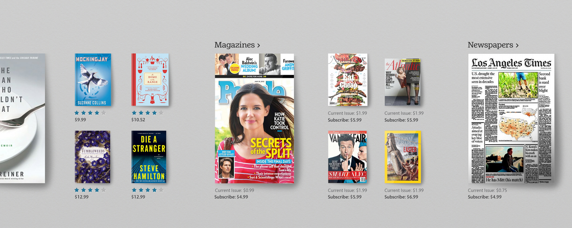
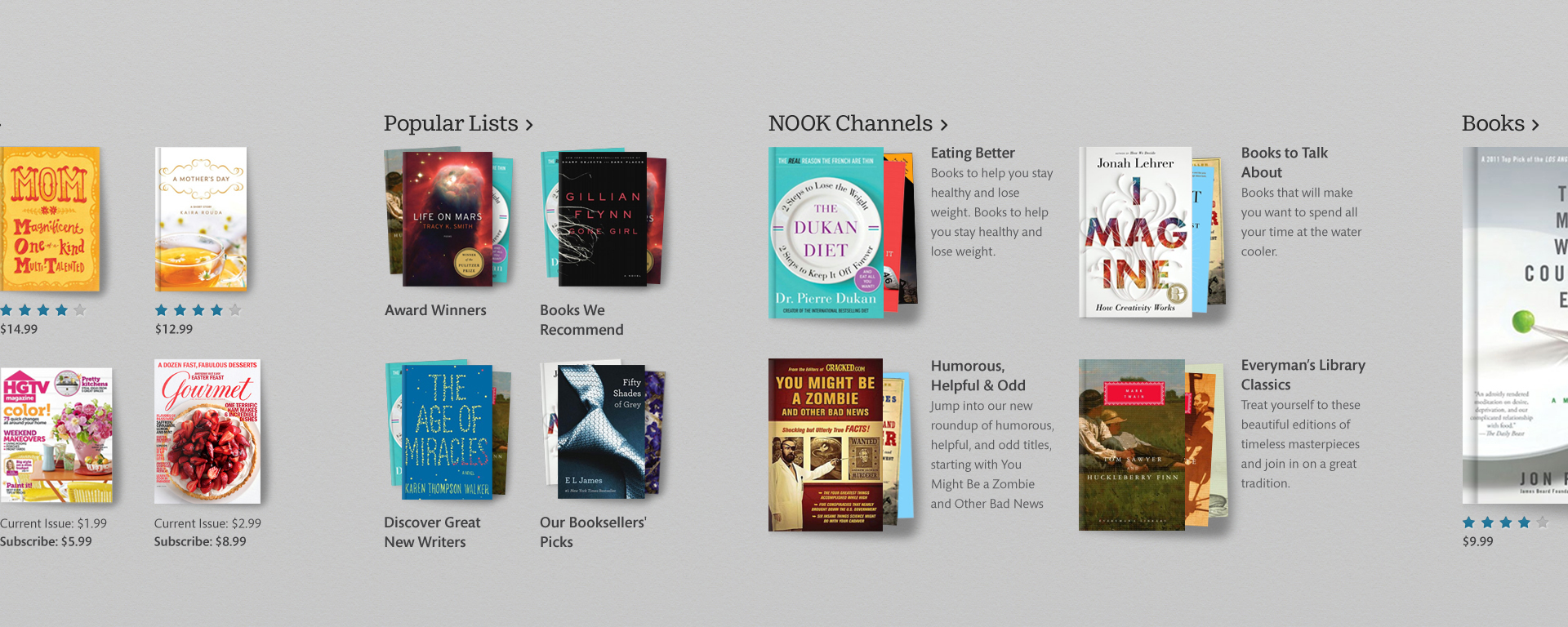
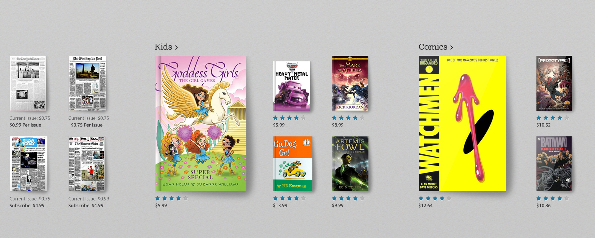
Design System
Upon conducting a comprehensive audit, I identified that the digital design system of Barnes & Noble was not meeting the standards of consistency and integration with Microsoft's Windows system.
I decided to create a new design system that adhered to Microsoft's design principles while also preserving the unique aesthetic of the Barnes & Noble brand. The new design system was a crucial component in achieving a cohesive and seamless user experience on the Windows 8 tablet.