WORKFLOWY
WorkFlowy
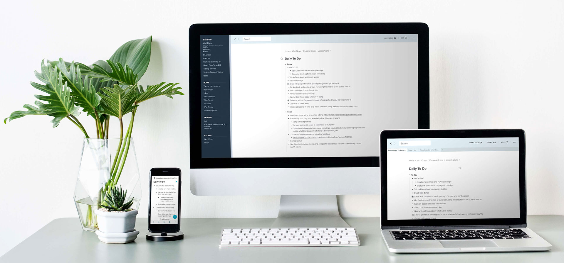
Mobile + Desktop App
WorkFlowy is a web-based productivity app that is designed to help users stay organized by providing a simple and intuitive text-based nested list interface.
Since its launch, the app has developed a reputation for its effectiveness and efficiency and has gained a loyal following among users. I was brought on board to enhance the visual brand and redesign the mobile and desktop apps to improve the user experience and make the app more visually appealing. My goal was to create a cohesive and polished design that would make WorkFlowy even more effective and user-friendly, helping users to better manage their tasks and stay organized.
My Role
As a designer, I was tasked with refreshing the visual identity of WorkFlowy by redesigning the logo and updating the look and feel of the mobile and desktop apps. I explored multiple design directions to ensure that the new design was cohesive and visually impactful. My goal was to create a modern and visually engaging logo that would effectively represent the brand, and to design a mobile and desktop apps that are not only easy to use but also enhance the user experience. The redesign aimed to make WorkFlowy more visually appealing and user-friendly.
WorkFlowy
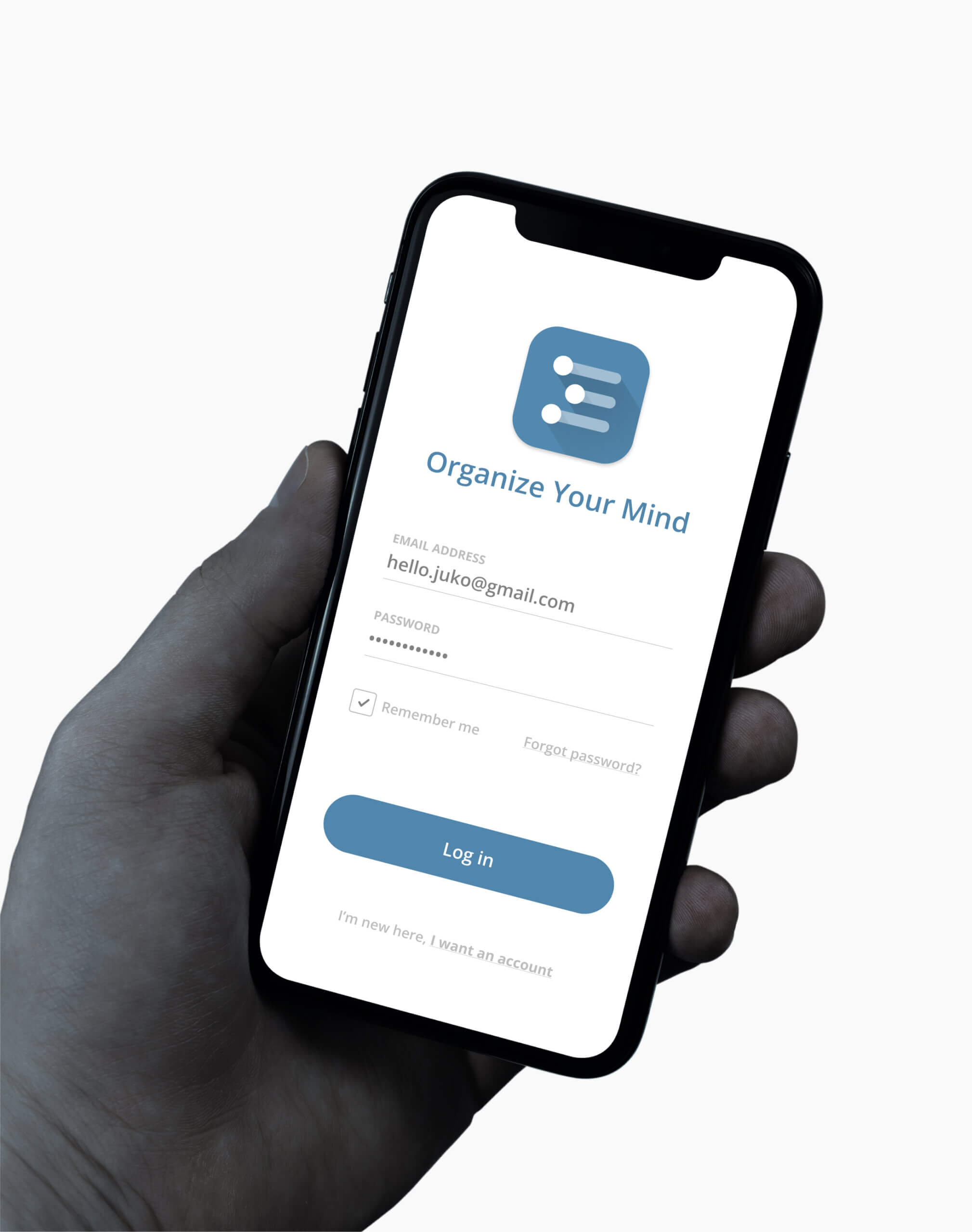
Logo Redesign
The existing WorkFlowy logo and app badge were in need of an update as they were dated and did not align with the modern and minimalistic aesthetic of the app and company.
My goal was to create a fresh and visually impactful design that effectively represented the brand. I explored a wide range of design options to modernize the logo and app badge, focusing on the core aspect of the app, the bullet list. After thorough experimentation and iteration, we landed on an updated, cleaner look that matched the simple and elegant vibe of the app.
WorkFlowy
Mobile App Redesign
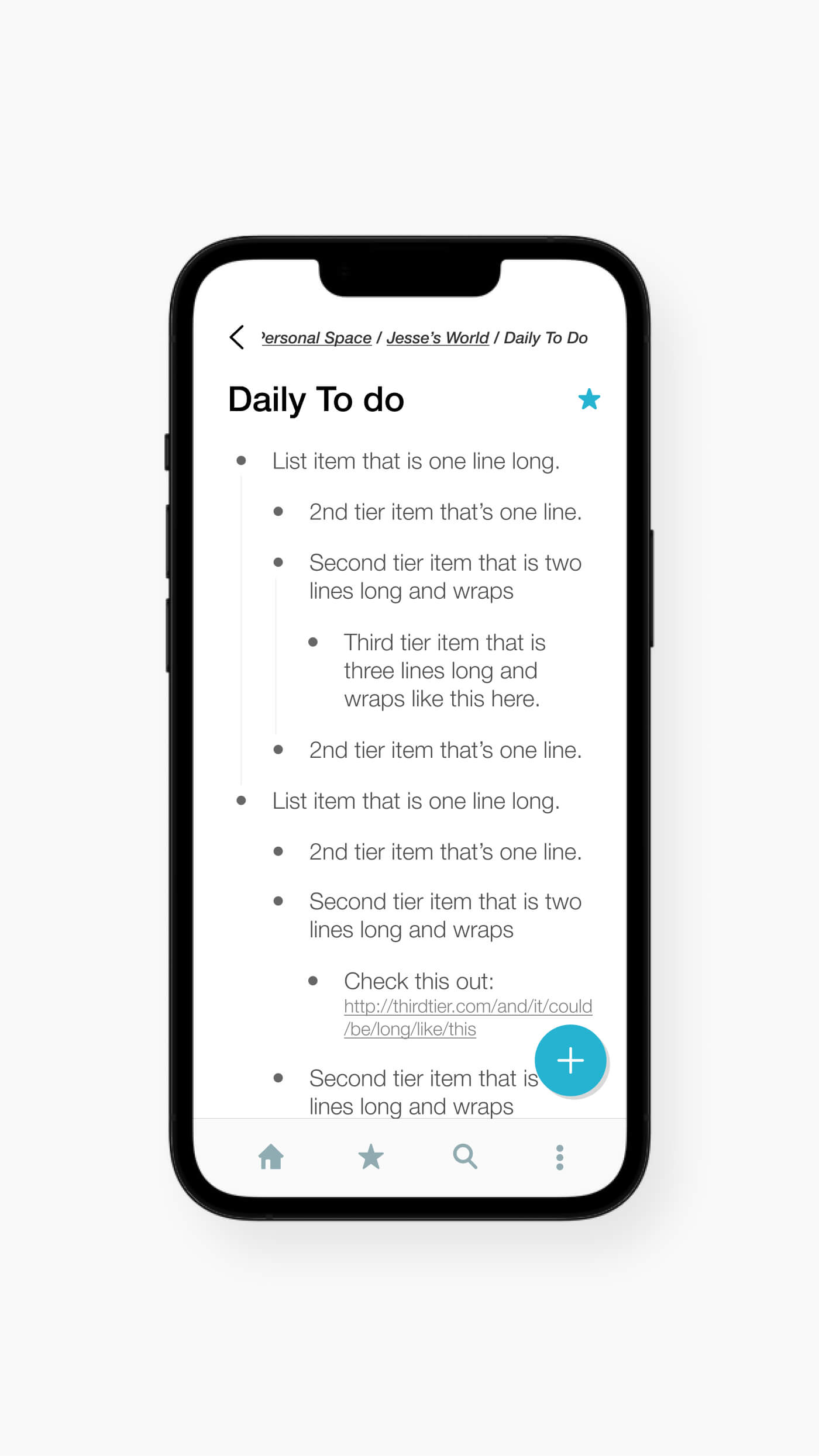
WorkFlowy is a unique app built around the concept of a bullet list, which at first glance may seem like a simple feature. However, after conducting thorough research and analysis of user feedback and suggestions, I discovered that the app had a lot of room for improvement. By understanding how WorkFlowy users were utilizing the app in their daily lives, I was able to gain a wealth of inspiration and insights on how to enhance the app's functionality and user experience. I took this knowledge and used it to update the app in meaningful ways that would provide value to the users and make their experience more enjoyable and efficient.
1. Breadcrumb
Displays the user's current location within the app structure, and allows users to easily navigate back to previous sections or pages.
2. Back Button
Sounds simple, but the back button was one of the most requested features by users. It was all about navigating through pages efficiently.
3. Bottom Toolbar
Provides users with quick access to frequently used features or actions within an app. This was standard practice and was missing from the previous version
4. Quick Add FAB
The FAB was designed to be highly visible and easy to reach, making it ideal for promoting the main action within an app, adding a new item.
WorkFlowy
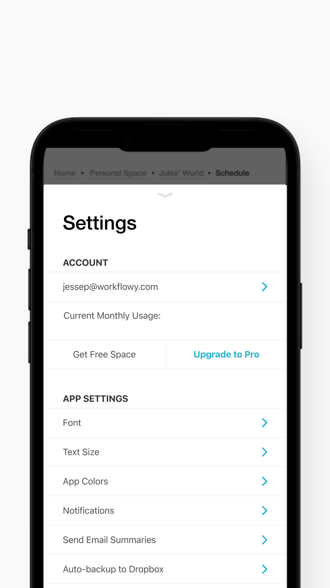
Desktop App Redesign
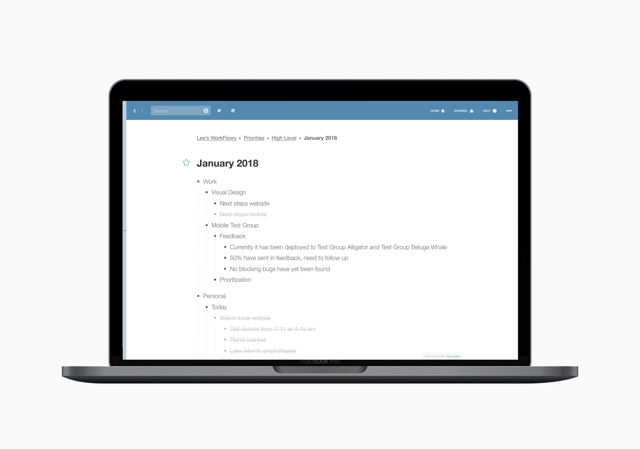
Workflowy is a simple, yet powerful, organizational tool that allows users to easily create and manage outlines and lists.
The desktop app provides a clean and intuitive interface that makes it easy to organize and keep track of ideas, tasks, and projects. With features like tagging, searching, and nesting, users can easily find and organize information in a way that makes sense to them. Additionally, the ability to collaborate with others in real-time makes it perfect for team projects and shared to-do lists. Overall, Workflowy's desktop app is a great tool for anyone looking to increase their productivity and stay organized.
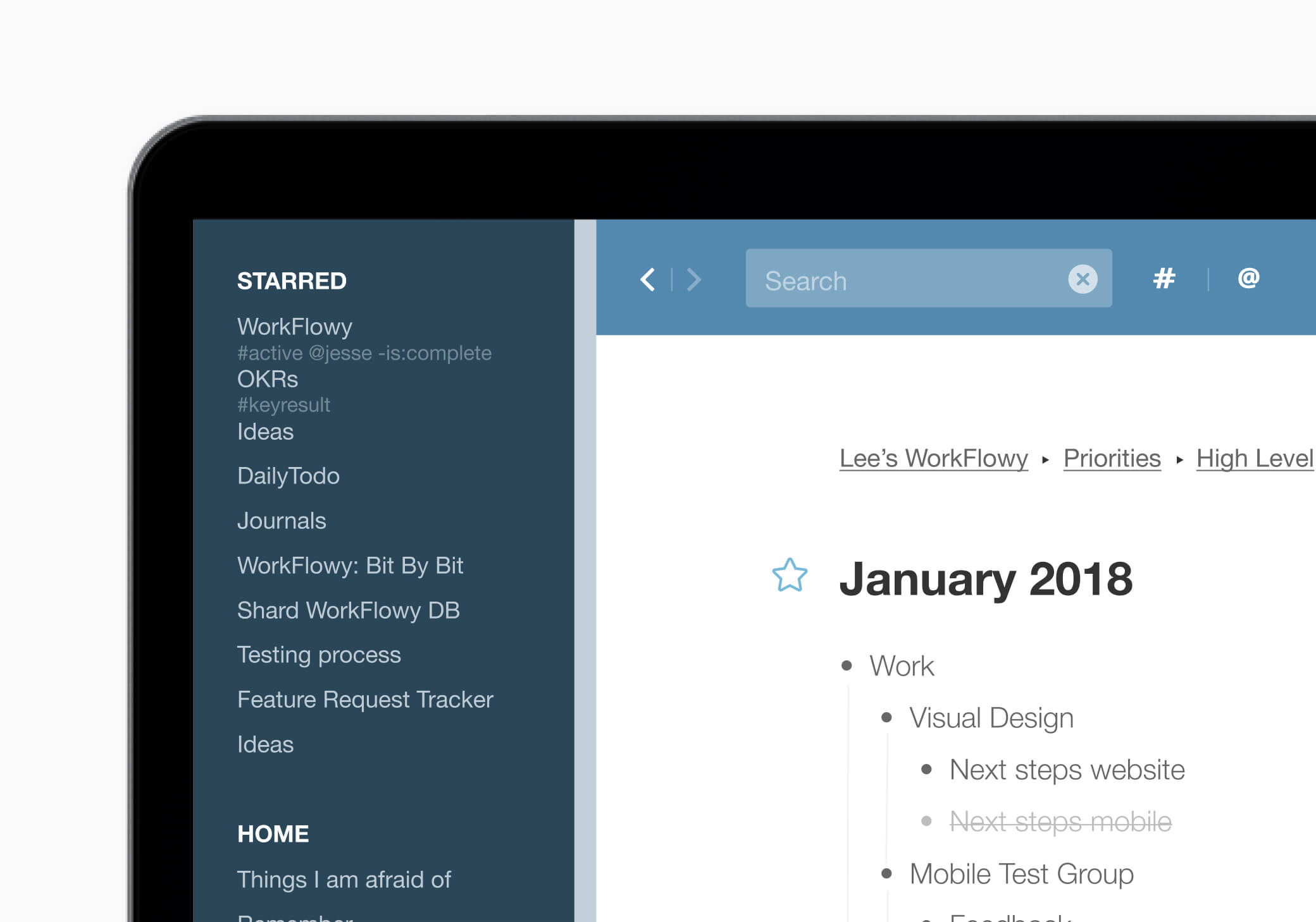
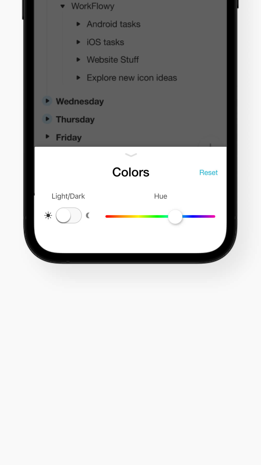
1. Drawer
The left drawer was a significant enhancement to the design, as it allowed us to include a variety of new features such as favorites and tagging, while still preserving a sleek and minimal aesthetic.
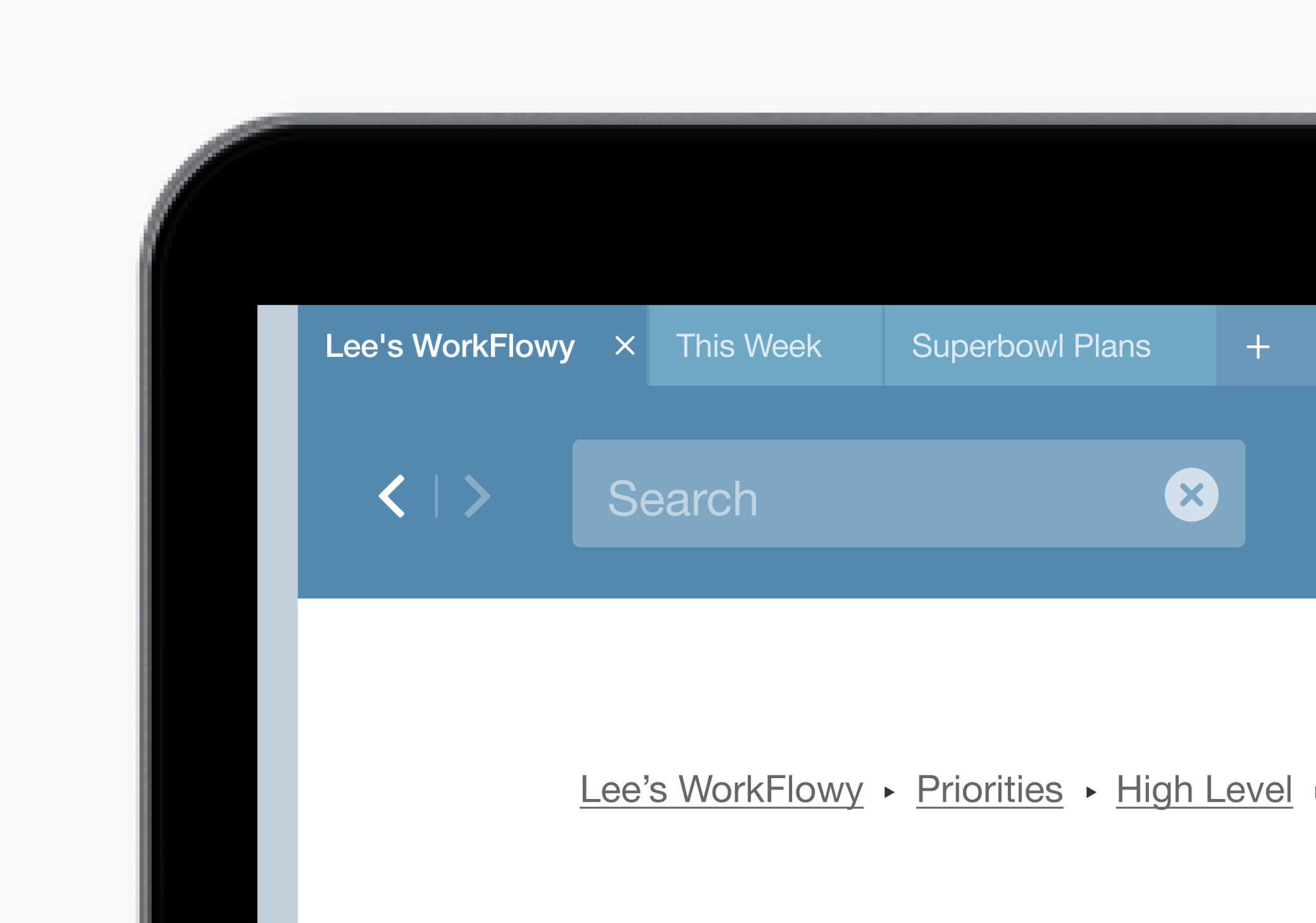
2. Search
Adding search was a game changer. It gave users the ability to find pretty much anything including tagged and saved content.
3. Favorites
The favorites feature allowed users to toggle on and off a star icon which provided quick access to there most used pages.
4. Tags
Tagging was another popular request by users. Adding tags to content gave users the ability to find individual items using search.